来过我博客的小可爱们应该会知道,五一期间我把博客重新弄了一遍。如果大家之前就来过我的博客的话,应该会知道,现在的美观程度和特效,是之前远无法比拟的!那么我们来看看,这些特效是怎么Duang上去的呢😜
添加结束标记
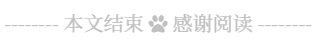
在文末添加自定义的结束标记,效果如下:
新建布局模板文件 post-end-tag.swig,添加如下代码:
<div>
  {% if not is_index %}
    <div style="text-align:center;color:#bfbfbf;font-size:16px;">
      <span>-------- 本文结束 </span>
      <i class="fa fa-{{ config.post_end_tag.icon }}"></i>
      <span> 感谢阅读 --------</span>
    </div>
  {% endif %}
</div>
在文章布局模板中添加如下代码:
| |
在站点配置文件末尾添加如下代码:
post_end_tag:
  enabled: true  # 是否开启文末的本文结束标记
  icon: paw # 结束标记之间的图标
重新推送后即可在文末看到结束标记。
为标签添加图标
默认情况下标签前缀是 # 字符,大家其实可以通过修改主题源码,将标签的字符前缀改为图标前缀,更改后效果如下:

在文章布局模板中找到文末标签相关代码段,将 # 换成 <i class="fa fa-tags"></i> 即可:
| |
侧边栏放左边
侧边栏默认是在右边的,我怎么都看不习惯,总感觉有点别扭。那么,给整到左边就完事儿啦!
在自定义样式文件中添加如下规则:
//侧边栏放在左边
.sidebar-toggle {
  left: 30px;
}

.sidebar {
  left: 0px;
}
修改动效脚本代码:
| |
这样的话就可以将侧边栏放置在左边了,但是当窗口宽度缩小到 991px 之后会出现样式错误,侧边栏收缩消失但是页面左侧仍有留白间距,此时修改如下代码即可:
| |
模块边缘摆动效果
这事就要从猪猪侠的博客说起了,也要和GitHub扯上关系了!!!也参考了Yearito's Blog的博客。当然,完全照搬是行不通的,毕竟主题版本不同,稍有差距,我得按照自己实际的改才行!目前是NexT7.1.0,到我写这篇文章的时候还是最新的(好像)也就是说,这不是挺好的么😀
说白了,只要有了js文件,再你主题怎么变化,万变不离其宗,稍作修改,总是能把特效添加上去的,Duang~
点击下方按钮下载脚本,并放到 themes\next\source\js\ 目录下:
在主题自定义布局文件中添加以下代码:
{# wobble窗口摆动特效 #}
{% if theme.wobble.enable %}
  <script src="/js/wobblewindow.js"></script>
  <script>
    //只在桌面版网页启用特效
    if( window.innerWidth > 768  ){
      $(document).ready(function () {
        {% if theme.wobble.header %}
          $('#header').wobbleWindow({
            radius: {{ theme.wobble.radius }},
            movementTop: false,
            movementLeft: false,
            movementRight: false,
            debug: false,
          });
        {% endif %}

        {% if theme.wobble.sidebar %}
          $('#sidebar').wobbleWindow({
            radius: {{ theme.wobble.radius }},
            movementLeft: false,
            movementTop: false,
            movementBottom: false,
            position: 'fixed',
            debug: false,
          });
        {% endif %}

        {% if theme.wobble.footer %}
          $('#footer').wobbleWindow({
            radius: {{ theme.wobble.radius }},
            movementBottom: false,
            movementLeft: false,
            movementRight: false,
            position: 'absolute',
            debug: false,
          });
        {% endif %}
      });
    }
  </script>
{% endif %}
在自定义样式文件中添加以下样式:
//窗口波动效果相关样式
if hexo-config('wobble')  {
  .sidebar {
    box-shadow: none;
  }

  .wobbleTransparentBK{
    background-color: rgba(0,0,0,0) !important;
  }

  .wobbleTransparentLine{
    border-color: rgba(0,0,0,0) !important;
  }

  //Next.Muse中为Header和Footer添加背景色
  .header, .footer {
    background-color: rgb(245, 245, 245);
  }

  //防止sidebar和footer同时开启动效时堆叠异常
  .sidebar, .header {
    z-index: 1 !important;
  }

  //防止挡住页末文章的阅读全文按钮
  .main {
    padding-bottom: 200px;
  }
}
Next.Muse 主题方案中 Header 和 Footer 是没有背景色的,所以需要添加背景色后才能看出边缘摆动效果。另外,实现边缘摆动效果所需的 z-index 属性可能会导致元素堆叠异常,需要添加以上样式来矫正。
在主题配置文件中添加以下代码:
# window woblle
wobble:
  enable: true  # 是否开启边缘波动效果
  radius: 50  # 波动半径
  sidebar: true  # 开启侧边栏边缘摆动
  header: true  # 开启头部边缘摆动
  footer: true  # 开启脚部边缘摆动
如果从本地加载 JS 脚本速度较慢,可以考虑将脚本放到 CDN 上再引入。
个性化回到顶部
参考 DIYgod 的博客 里的特效,原理很简单:将 back-to-top 按钮添加图片背景,并添加 CSS3 动效即可。
首先,找到自己喜欢的图片素材放到 source\images\ 目录下:
或者:链接:https://pan.baidu.com/s/1J0dJOa2oWFwNR8pvG6vBFQ 提取码:lstv
然后在自定义样式文件中添加如下代码:
//自定义回到顶部样式
.back-to-top {
  right: 60px;
  width: 70px;  //图片素材宽度
  height: 900px;  //图片素材高度
  top: -900px;
  bottom: unset;
  transition: all .5s ease-in-out;
  background: url("/images/scroll.png");

  //隐藏箭头图标
  > i {
    display: none;
  }

  &.back-to-top-on {
    bottom: unset;
    top: 100vh < (900px + 200px) ? calc( 100vh - 900px - 200px ) : 0px;
  }
}
刷新浏览器即可预览效果。
豆瓣页面
为站点添加豆瓣阅读 / 电影 / 游戏页面,效果参考博客中的豆瓣页面!
具体是怎么实现的,可以参考GitHub上的一个开源项目,这个项目的创意是真的很不错!Hexo—Douban
首先,在根目录下执行以下命令安装相关依赖:
npm install hexo-douban --save
然后,在站点配置文件中添加以下内容:
douban:
  user:  # 个人豆瓣ID
  builtin: false
  book:
    title: 'This is my book title'
    quote: 'This is my book quote'
  movie:
    title: 'This is my movie title'
    quote: 'This is my movie quote'
  game:
    title: 'This is my game title'
    quote: 'This is my game quote'
  timeout: 10000
user: 填写豆瓣 ID。登陆豆瓣后点击个人主页,此时 url 中最后一段即是用户 ID,一般情况下会是一段数字,如果设置了个人域名的话,则个人域名即为 ID。
- builtin: 是否将生成页面的功能嵌入
hexo s和hexo g中。 - timeout: 爬取数据的超时时间。
如果只想生成某一个页面(比如只生成读书页面),把其他的配置项注释掉即可。
在主题配置文件中新增菜单入口:
menu:
  home: / || home
  tags: /tags/ || tags
  categories: /categories/ || th
  archives: /archives/ || archive
  about: /about/ || user
  books: /books/ || book
  movies: /movies/ || video-camera
  games: /games/ || gamepad
在语言包中新增菜单中文:
| |
然后在根目录下执行以下命令生成豆瓣阅读 / 电影 / 游戏页面:
$ hexo douban
可选参数:
- -b | --books: 只生成豆瓣读书页面
- -m | --movies: 只生成豆瓣电影页面
- -g | --games: 只生成豆瓣游戏页面
执行命令后,插件会根据用户提供的 ID 爬取豆瓣中的数据信息并在 public 目录下生成对应的页面,当服务器启动或部署后会将页面显示在对应的菜单路由下。
通常大家都喜欢用 hexo d 来作为 hexo deploy 命令的简化,但是当安装了 hexo douban 之后, hexo d 就会有歧义而无法执行,因为 hexo douban 跟 hexo deploy 的 Alias 都是 hexo d。